Performance indicator
Every chart has a performance indicator which breaks down how fast its latest query was processed. This information can help identify less-performant widgets and optimize the performance of your dashboard. The performance indicator can be found by going to the data settings of a chart, and clicking on the stopwatch iconin the top left corner of the widget itself.
Reading the performance indicator
Each performance statistic is measured in miliseconds.
- Retrieved:
- Rows: total rows that were sent by the data source to Luzmo.
- Result: The number of rows that are displayed by the chart.
- Validating: time spent checking if the query is sane and well-formed
- Preparing: time spent transforming the query (e.g. retrieval of metadata, security checks, row-level filtering, linked filtering, recursive unrolling of expressions, ...)
- Queuing: time the query is waiting to be executed (e.g. waiting for 'concurrency control' reasons)
- Querying: time spent waiting on a result from your data source
- Processing: time spent post-processing results
- Rendering: time spent visualizing the results
- Total: total time spent from start to finish
Interpreting the performance indicator
Learning to interpret the performance indicator quickly becomes intuitive with these three steps:
- Start with the total at the bottom.
- Analytical queries need to be performant in order to drive engagement with dashboards. Ideally, a dashboard needs to respond subsecond level to drive the best engagement from end users.
- Performance times between 0.5 - 2 seconds are generally acceptable, while dashboards that take more than 3-5 secconds quickly start to feel frustrating.
- Charts should never take >10 seconds to load, unless your end users are expecting highly complex queries and longer query times.
- Check the number of rows retrieved.
- A high number of rows retrieved can cause low performance.
- A good rule of thumb is that it takes roughly 1 second to stream 10k rows of data.
- Example: a chart returning 33k rows that takes 3.5 seconds in the Querying category is actually quite performant - it is only spending ~300 miliseconds running the query in the database. Most of the rest of the time is spend streaming data back to Luzmo.
- A high number of result rows can cause long Rendering times, as each of these rows will need to be visualized by the browser.
- The more rows that are needed per result data point, the less efficient the query is to run.
- An optimal (pushdown) query returns exactly the required rows to display. As such, 'Pushdown Efficiency' can be calculated by dividing the number of result rows displayed by number of rows returned from the data source.
- Break down the components of the performance indicator - are there any areas that seem to be taking disproportionate amounts of time?
- Validating, Preparing and Queuing are indicating time spent by the Luzmo application and typically tend to take a small fixed amount of time. These aspects cannot be directly influenced, but should only take up a small portion of the total time spent to visualize your data.
- Rendering happens client-side, so the performance is largely dependent on the hardware of the device that renders the item(s). Luzmo does ensure an optimized end-user experience here by lazy loading certain data, enforcing a maximum limit on the amount of data points each item can performantly visualize on an average device, etc.
- Querying
- This time starts when the query is dispatched to the connector
- This time stops when the connector finishes streaming back all necessary data from the data source.
- Calculated columns and Aggregation formulas can also influence querying time, as those calculations must be completed in this step.
- More information about improving query performance can be found in this article
- Processing
- Once data is streamed back, Luzmo will need to process each row for visualization.
- Long processing times can be caused by a high number of rows retrieved (see note above).
- Rendering
- Charts displaying large amounts of data can take a long time to render.
- Consider applying further filtering on the chart, or adding a limit on the amount of data points to visualize, to avoid large amounts of data to be visualized.
- Querying
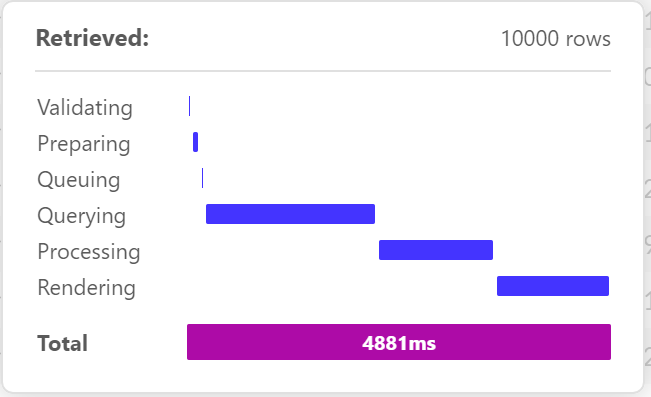
Example 1: A number with evolution chart
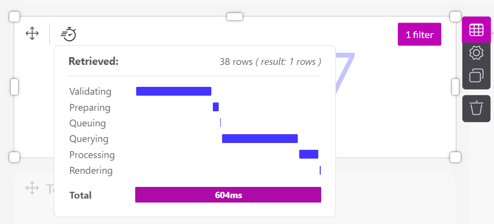
Using the performance indicator interpretation guide from above:
- In the performance indicator pictured above, we can see that this number with evolution chart was ready in 604 miliseconds, or 0.604 seconds - a good performance for an analytical query.
- Let's quickly check the rows retrieved to make sure everything looks ok:
- Rows: 38 rows are being returned from the data source - this should not have a significant inpact on the Query time due to streaming data.
- Result: 1 row is being rendered for the chart.
- Pushdown Efficiency: 1 result divided by 38 rows equals a pushdown eficiency of 2.6%. This is not very high, but shouldn't be a problem in this case because of the limited total number of rows returned.
- Looking at the performance breakdown, it's clear that the query spent most of it's time Validating and Querying (hovering over a bar will show exactly how much time spent in each).
- In general, time spent validating cannot be easily influenced by changing chart settings or the underlying data model, and will remain similar between query runs.
- Because of the low number of rows retrieved, most of the querying time is likely spent by the data-source to fetch the initial 38 rows of data.
Conclusion:
This chart probably does not need further optimization at this time. However, a growing dataset may result in decreasing pushdown efficiency and therefore decreasing performance. The performance of this item would be worth keeping an eye on.
Example 2: A table
Tables display row level data, and they can be configured to display large ammounts of data in the chart settings. In this case, this chart has been set to load up to 40.000 rows. Because tables display row level data, it's normal for them to be less performant than other dashboard charts.
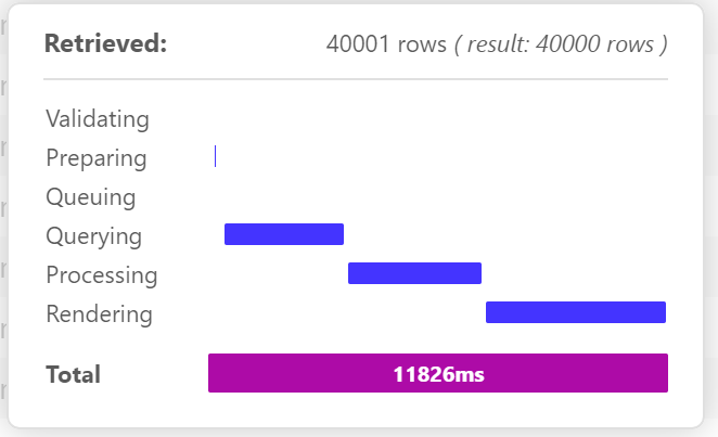
Using the performance indicator interpretation guide from above:
In the performance indicator pictured above, we can see that this table chart was ready in 11.826 miliseconds, or 11.8 seconds - much too slow for customer-facing analytics.
Let's quickly check the rows retrieved to make sure everything looks ok:
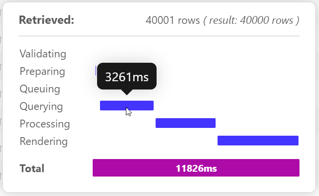
- Rows: 40.001 rows are being returned from the data source - this will have a large impact on the Query time as 40k rows will take ~4 seconds to stream the data.
- Hovering over the Querying section of the bar shows the query is taking 3.26 seconds, which means the query + streaming time is actually completing very fast.
- Result: 40k rows are being rendered for the chart - this explains the long Processing and Rendering times
- Pushdown Efficiency: Regular tables show row-level data, so the pushdown efficiency will always be ~100%.
- Rows: 40.001 rows are being returned from the data source - this will have a large impact on the Query time as 40k rows will take ~4 seconds to stream the data.
Looking at the performance breakdown, it's clear that the query nearly equal times on Querying, Processing and Rendering.
- Reducing the number of rows rendered will help will all 3 of these, as the less rows Luzmo needs to handle, the faster each step will take
Conclusion:
Enabling infinite scrolling in the table settings will result in the chart rendering the first 10k rows of data returned, while the rest of the data streams in the background. If the user scrolls past the initial 10k limit, the next batch of 10k will be loaded:
Enabling the infinte scrolling feature speeds up the table to a 4.8 seconds load time - not fast, but much more acceptable.