Changing the settings of the Measure slot
When building a dashboard within Luzmo, you have a lot of possible charts to choose from. Every chart has his own specific settings, but the options for the measure data within the charts are all quite the same. Let me show you what I mean!
Measure slot settings
By clicking on the setting icon of the Measure slot inside an object, you get a pop-up that looks like the one below. But what are the meanings of these different options?
Label
In the ‘Label’ field you can choose which title should be visible for that variable. This label will be visible in your dashboard and graph, f.e. in the popover of the chart.
Data info
This is the info icon
Format change
You can also change the format of your data displayed on the axis of an object.
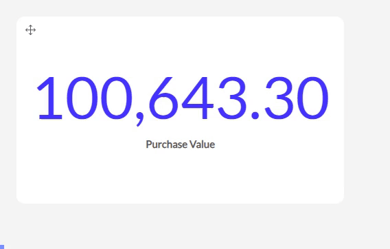
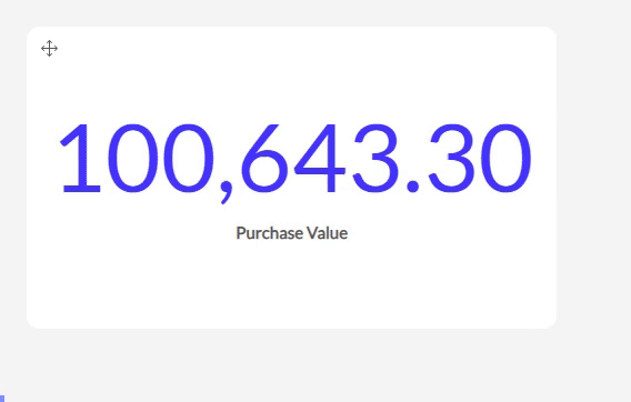
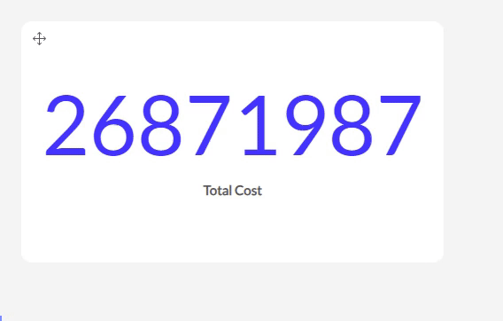
The ‘123’: By default it will show the numbers without any formatting.
You can also choose to show your value as a percentage. Be sure to have your values as decimals in your dataset. F.e. 0.33 will show up as 33 %.
The SI option works with SI units and symbols. F.e. 10000 will show up as 10K, 1000000 as 1M,...
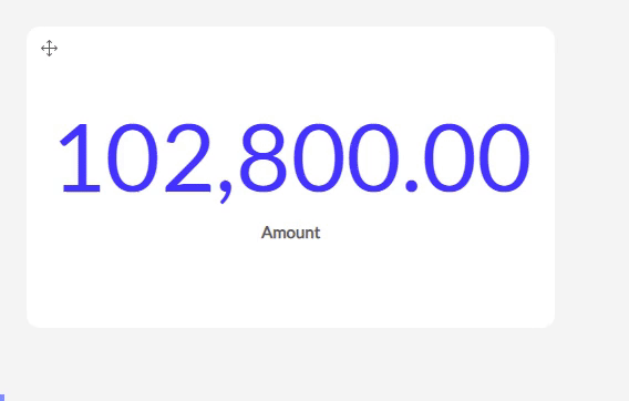
Decimals
In the Decimals section, you can decide:
how many decimals should be shown.
if there should be a separator for units of thousands.
and if this separator should be a point or a comma.
The aggregations
Furthermore, there are a few different types of aggregations. Here’s an overview of the outcome of each.
- Sum: (only for numeric columns) This default option gives you the sum of all values (rows) of this column.
- Cumulative Sum: (only for numeric columns in the bar, column, line & area charts) Used to display the sum of a measure over time. For each period, it will sum the currents' period value with the previous total giving you the progression of the sum over time. It essentialy shows the sum of the measure incorporating all data up to the period.
- Avg (only for numeric columns) Will calculate the average of all values.
No weighting will give you the default average value without a weight.
While weighing over another chosen variable will give you the average in respect to its weight factor (the weighting column). Say you run a social media campaign and you have different days with a number of clicks and a number of impressions. In order to calculate the global average Click Rate (Clicks/Impressions) you’ll need to take the average of the Clicks and weigh them over the number of impressions.
Count Rows : Is straightforward, it will count the number of entries for that variable in the dataset.
Count Distinct : will also perform a count, but it will not count duplicate values. An example: if you have an orders dataset (1 row per order) which is linked to a specific product and you would like to analyse how many unique products you sold (not the number of orders), you can use the distinct function on your ‘product name’ column).
MIN : will show you the minimum value for that measure.
MAX : will show you the maximum value for that measure.
Standard Deviation : The standard deviation aggregation calculates the standard deviation of the numbers in your column and will show this as the measure.
Rate : The rate aggregation gives you the option to divide the sum of the values of your measure column by the sum of the values of another column
As you can see, there are multiple options for displaying your measurement data. As such, you can make your dashboard more readable and specific.
Don't hesitate to contact us in case of questions on this topic. We're happy to help!