Period comparisons
In this article, we'll guide you through setting up period comparisons in your Luzmo dashboards via the following functionalities:
Period comparisons in charts - This section covers how to incorporate period comparisons directly into various Luzmo chart types by dragging a datetime column into the "Category" or "X-axis" slot and placing your measure (for instance, sales or units sold) into the "Measure" slot. You can then configure period comparisons via the chart’s settings by first selecting a mode (no comparison/past value/absolute change/percentage change) and then either choosing a fixed interval (like comparing a specific quarter to the same quarter in the previous year) or a flexible period determined by active datetime filters.
1.1 Date comparison filter: Variable period comparisons with help of the “Date comparison filter” item, for all charts that already support period over period in their slot menu.
1.2 Regular period comparison: Regular period comparisons for charts without a date column on the category or X-axis, for all charts that already support period over period in their slot menu.
Period comparisons via the Number with evolution widget - This section explains how to use the “Number with evolution” widget to perform period comparisons. After adding the widget to your dashboard, you can populate the "Measure" slot with a column that contains the KPI values you want to display and the "Evolution slot" with a date(time) column to set the time period for comparison. The widget then presents the main number (aggregated measure value for the current period), the Percentage change (evolution of this value compared to a previous period) and the Trend graph (a visual representation of how the measure has evolved over time).
Period comparisons via derived columns - In this section, the focus is on leveraging derived columns to perform period comparisons, which can be particularly useful when the built-in functionality isn’t enough or when you need more advanced calculations. Two main approaches are covered:
3.1 Rolling dates: This method involves creating a derived column that groups data into continuously moving time windows (for example, a rolling 7-day period). This will let you see dynamic trends (such as daily changes in the last week).
3.2 Period to Date: This approach ensures that you compare equal time spans. For example, rather than comparing an entire month to a partial month, you might compare the first 5 days of one month with the first 5 days of another.
Custom period comparisons - This section delves into advanced, customizable period comparison techniques that go beyond standard chart configurations:
4.1 Flexible selector: Here, you import the same dataset twice into your dashboard. One dataset represents the “current period,” while the other serves as the reference for the period to compare against. This setup enables the use of filters (like a "Current period selector" and a "Time to compare to selector") along with conditional colored number charts to display both the percentage change and the actual difference.
4.2 Predefined ranges: This method requires that your dataset already includes calculated period ranges. You then use these ranges by dragging the "Range" column into the "Group By" slot of a chart (like a Grouped Line chart), which compares the measure across these fixed intervals.
4.3 Date formatting: An alternative approach is to set up period comparisons through the formatting of your date(time) data. For example, by grouping data by Year and using Month as the display category, you can easily create Year-over-Year comparisons (or other configurations like Month-over-Month or Quarter-over-Quarter) within various types of charts.
1. Period comparisons in charts
Basic set-up
You can use period comparisons in the following Luzmo charts:
To create a period comparison in these charts, follow these steps:
- Add a date column: drag a datetime column to the Category or X-axis slot.
- Add the data you want to compare: add the data to aggregate (e.g., sales or units sold) to the Measure slot.
- Access the settings: hover over the chart and click the data table icon in the menu that appears to the top right of the chart. Click on the Measure slot to open its settings.
- Configure the period comparison mode: in the slot menu, open the "Period comparison" dropdown and select your preferred mode. More information on period comparison modes can be found in the "Period comparison options" section below.
- Configure the comparison time period: once a period comparison mode is selected, extra options will appear below the dropdown. This will allow you to configure the time period for which the values can be compared and you have the option to adjust the number of units and the date level (year, quarter, etc.) for the comparison. More information on time period configuration can be found in the "Time period configuration" section below.
The video below shows all these steps in sequence in a bar chart.
Period comparison options
The period comparison dropdown in the chart slot menu has 4 available options:
These different options allow you to tailor your period comparison to your particular use case. We'll now walk you through the details of each of these options and when to best use them.
No comparison
Default. No period comparison will be done and the normal value of the measure will be displayed.
Past value
The chart will display a past value for this measure, based on the configured time period. This mode is useful when you want to visually compare the value of a measure between various periods.
For example, when you want to compare year-over-year quarterly revenue you could add the Revenue column twice to the Measure slot of your chart:
- configure the first measure to "No comparison"
- configure the second measure to "Past value", "from 1 year ago"
The result will look like the image below, allowing you to easily visualy compare year-over-year changes in revenue.
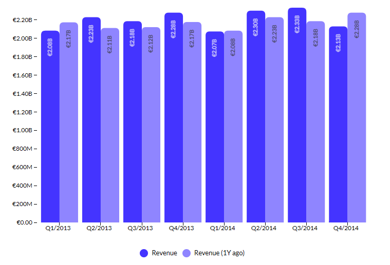
Note that you can also add a column more than twice to the Measure slot if you want to compare more than two time frames, for example this year, last year and 2 years ago.
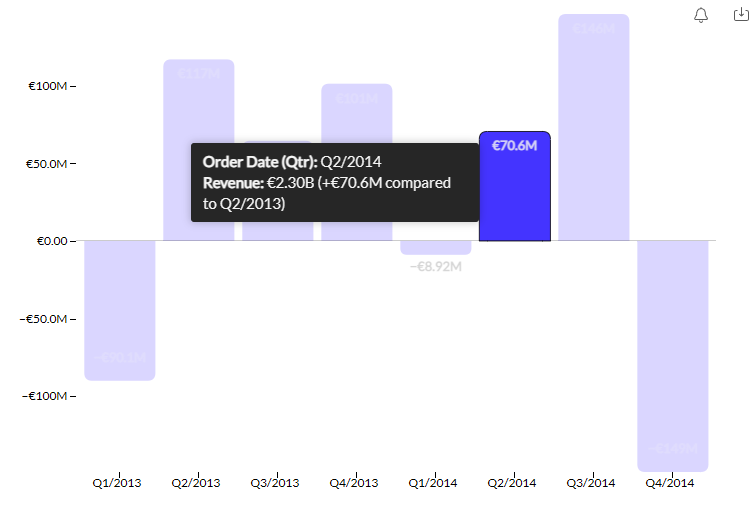
Absolute change
Instead of displaying the value of the measure, the absolute change compared to the configured time period will be displayed in the chart.
For extra clarity, hovering over a value in the chart (e.g. a bar) will show a tooltip that shows the value of the measure, its absolute change and the time period that is being compared against.
Example usage in a column chart:
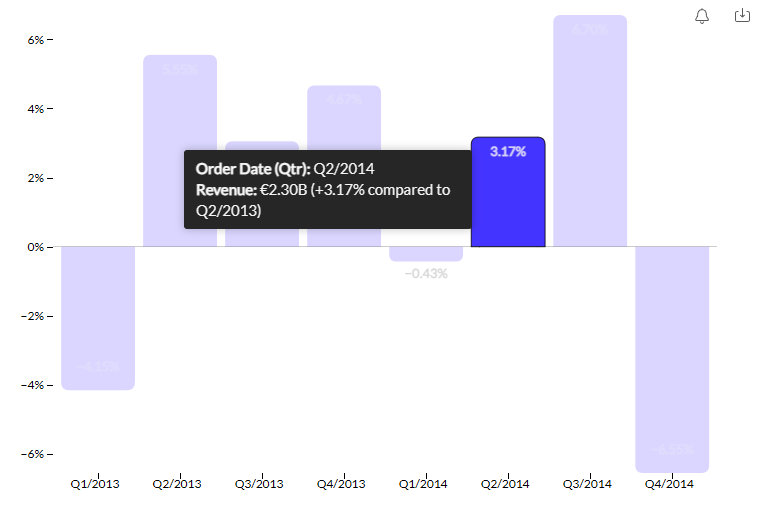
% change
Instead of displaying the value of the measure, the percentage change compared to the configured time period will be displayed in the chart. For extra clarity, hovering over a value in the chart (e.g. a bar) will show a tooltip that shows the value of the measure, its percentual change and the time period that is being compared against.
Example usage in a column chart:
Time period configuration
Once you have set a period comparison mode (either "past value", "absolute change" or "% change"), some new options appear below the dropdown that allow you to configure the time period that will be compared against.
There are two main modes of time period configuration, which will be explained in the following section.
Fixed interval mode
This mode is used when you want to compare data at a fixed interval, such as comparing a year to the previous year, or a quarter to the same quarter from last year.
This mode activates when you select anything other than “Period(s)” in the Period comparison dropdown. The options in the dropdown will be limited to date levels equal to or above the date level used in the Category slot (e.g., if you’ve selected "Quarter," the available options will be "Quarter" and "Year").
The image below shows a bar chart with the second measure configured to "Past value, 1 year ago". The top bar shows Units sold in Q2 2016, while the bottom bar compares it to exactly one year earlier, Q2 2015.
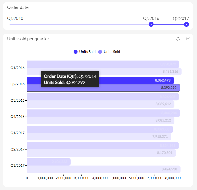
Period mode
This mode can be used to compare more flexible periods, for example comparing the last 42 days to the previous 42 days. The custom "period" to compare against is defined by the datetime filters active on your chart. If no datetime filters are active on that chart, the period is undefined and no data will be returned for this comparison.
For example in the image below, the second measure in the bar chart is configured to Past value, 1 period ago. The period in this case is defined by the Slider filter above on "Order Date", which sets an active filter to show data from Q1 2016 to Q3 2017, i.e. a period of 7 quarters. This means the bar chart will compare Units Sold for each quarter with Units Sold for 7 quarters ago. In the highlighted example, Q2 2016 (top bar) is compared to Q3 2014 (bottom bar) — 7 quarters earlier.
1.1 Date comparison filter
Variable period comparisons with help of the “Date comparison filter” item, for all charts that already support period over period in their slot menu. Adding a Date comparison filter in your dashboard, this gives you the option to choose two time periods, first you would select the Date range and second the comparison range.
1.2 Regular period comparison
Regular period comparisons for charts without a date column on the category or X-axis, for all charts that already support period over period in their slot menu. The time period will be defined based on the selection you make on the Date filter.
2. Period comparisons via the Number with evolution widget
The Number with evolution chart can be found in the General section after clicking the "Add item" button. You can either click on it or drag & drop it into the canvas, after which you will need to:
- Add a column to the Measure slot for values
- Add a date column to the Evolution slot for period comparisons
The chart will show the main value, percentage change, and a trend graph and you can customize it with colors, icons, and layout options.
Please see our dedicated Academy article on the Number widget for more details and useful tips & tricks.
3. Period comparisons via derived columns
3.1 Rolling dates
Rolling dates can be used to analyze data over a specific interval that 'rolls' with time. For example, you might want to track the number of applications received in the past week and see how this changes each day.
To implement this in Luzmo, you'd start by either creating a derived column that calculates the 'rolling period' in the Luzmo UI or by creating a column in your database using the same calculation logic (this is the recommended approach, as it will ensure the calculations are done by your database, which is more performant). Here's an example of the formula which can be used to created rolling dates comparisons:
DATE_ADD('day', DATE_DIFF('day',your date column, NOW())%7, your date column )
This formula will group all data from the last 7 days into one point, data from the 7 days before that into another point, and so on. If you want to have a rolling period of a different amount of days, change out the number 7 in above formula to the amount you did like to compare on. Similarly, you can change the 'day' to another level ('week', 'month', ...)
You can use this derived column as your Evolution slot in the Number chart. This will show the number of applications for each rolling 7-day period.
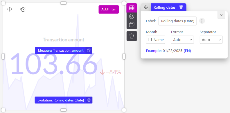
In this example, the resulting number '103.66' represents the sum of transactions from the most recent 7-day period. An 84% decrease signifies a drop in the sum of transactions when compared to the prior 7-day period. This dynamic view helps to identify trends or patterns in your data, providing timely insights into performance.
3.2 Comparable periods
Comparable periods can be used to make meaningful comparisons across similar time periods.
Using the default "month" level of a date column will allow you to compare data based on calendar months. Meaning that on May 5th, you would compare the data of the entire month of April with the data of the entire month of May (which is only 5 days on May 5th). Depending on your use case this may mean that using the default "month" level of a date column gives you a skewed comparison.
Instead you might want to compare the data of April 1 through 5 with the data of May 1 through 5. This is what is called a comparable periods comparison. It allows you to compare an equal amount of days with each other, i.e. when it's the 5th of the month it will compare the first 5 days of this month with the first 5 days of the previous month, when it's the 16th it will compare the first 16 of this and the previous month, when it's the 27 it will compare the first 27.
To implement this in Luzmo, you'd start by either creating a derived column that calculates the 'rolling period' in the Luzmo UI or by creating a column in your database using the same calculation logic (this is the recommended approach, as it will ensure the calculations are done by your database, which is more performant).
IF( DAY( your date column ) <= DAY( NOW() ), Measure, 0)
This formula will return the Measure value if the day of the 'Date column' is less than or equal to the current day of the month, and 0 otherwise.
You can use this derived column in the Measure slot, and the default "month" level of your date column in the Evolution slot.
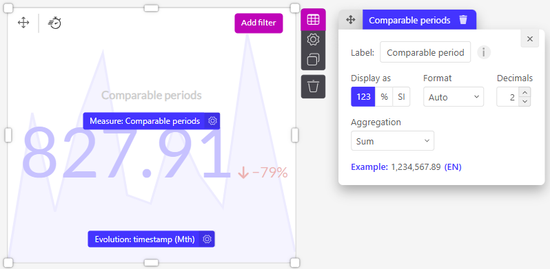
For example, after applying the comparable periods calculation, let's say you're left with the number '827.91', as shown in the screenshot above. As for the '79%' drop, this is indicative of a reduction in the sum of transactions between the comparable periods.
Tips:
- We recommend creating these derived columns in your database, not directly in Luzmo, to avoid potential performance issues.
- If you're comparing across different years, ensure your data covers the entire range to avoid skewed comparisons.
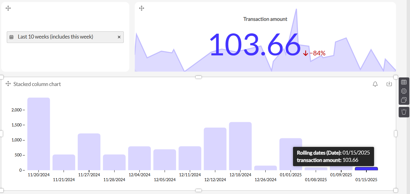
- The derived columns that you created for the "Rolling dates" and "Comparable periods" comparisons can also be used in other types of charts. For example, dropping the "Rolling dates" derived column in the Category slot of a column chart will also generate a trend visualization:
4. Custom period comparisons
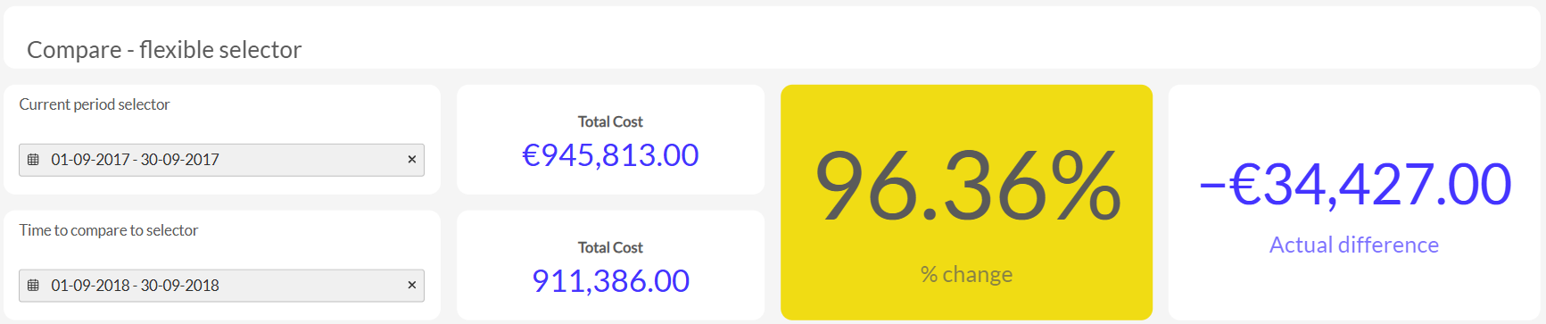
4.1 Flexible selector
This custom comparison can be set up by having the same dataset imported twice in Luzmo.
- The "Current period selector" filter and top Number chart are getting data from the first dataset, while the "Time to compare to selector" filter and bottom Number chart are getting data from the second dataset.
- The "% change" chart is a Conditional Colored number, where the Measure is getting data from the second dataset and the target comes from the first dataset. In the chart settings, the display is set to "percentage to target" and the conditional color is also enabled.
- The "Actual difference" chart is also a Conditional Colored number with the data configured in the same way. In the settings, the display is set to "difference to target", but the conditional color is not enabled.
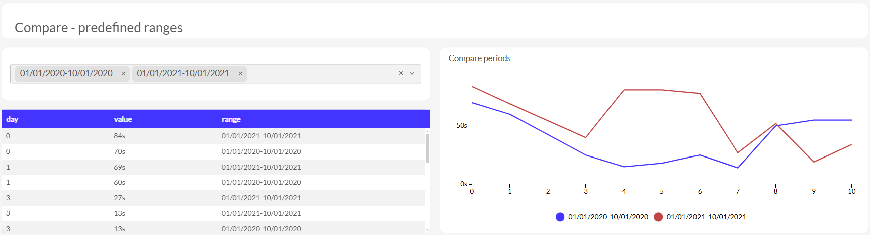
4.2 Predefined ranges
This custom comparison requires precalculated periods as part of the dataset (see the table in the screenshot for a sample of the data used to make these charts).
The "range" column is dragged into the "Group by" slot of the Grouped Line chart, the "value" is dragged into the "Measure" slot and the "day" is dragged into the "X-axis" slot.
4.3 Date formatting
You can easily create a Year-over-Year, Month-over-Month or other type of period comparison by using the "Period in Year" display setting in the Category slot. Please see the video below, where this is done for a Grouped Column chart.