Regular Table
The Regular Table is the right choice if you want an unaggregated, detailed view of your data. In Luzmo, the Regular Table serves this purpose, and in this article, we will explore its key functionalities.
1. Overview of the Regular Table in Luzmo
The Regular Table in Luzmo is designed to present raw, row-level data. Unlike other charts, it doesn't perform aggregations, keeping it clear and straightforward.
When to Use the Regular Table:
- Matrix Display: For data that naturally fits into a matrix or tabular format with specific rows and columns.
- Data Review and Comparison: Use it when you want to dive deep into your data, examining exact values, not just visuals. Rearranging your data fields is simple. Navigate to the 'Columns' section and adjust them to your desired sequence.
2. Conditional Formatting
The ability to apply conditional formatting is a significant feature of the Regular Table. With this, you can emphasize certain data based on pre-defined criteria using colors, badges, or bars. For a comprehensive guide on how to set this up, please refer to our detailed article on Regular Table with Conditional Formatting.
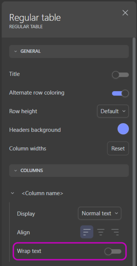
3. Text wrapping
In case you have one or more columns that contain larger amounts of characters (e.g. full text, reviews, comments, etc.), you can enable "Wrap text" for each of these columns in the settings of the regular table.
4. Sorting in the Regular Table
Understanding data often requires viewing it in a certain sequence or order. In the Regular Table, the sorting functionality lets users arrange data in an ascending or descending order based on the arrows on the right of the columns.
In the settings section of the Regular Table (Settings>Interactivity>Sorting) the designers can choose how the sorting of the table is going to work:
Two options are available:
- Multi-column sorting: This is the default option when you create a Regular Table. It provides the ability to sort more than one column and create an advanced sorting to fit more complex requirements. The first column sorted is the primary sorting column. Then additional sorting can be added by clicking on other columns
- Single-column sorting: This option allows the sorting on only one column. Clicking on a column will set the table sorting and when clicking on another column the table sorting will change based on the column clicked.
By default, the table will sort from left to right ascendingly, but dashboard designers can set the default sorting in the dashboard editor by clicking on the column headers (see video below). Viewer users are still be able to adapt the order similarly in the embedded dashboard, but this won't be stored.
5. Infinite Scrolling
The Infinite Scrolling feature is aimed at enhancing the performance for tables with substantial rows, here’s what you should know about this new addition:
- Feature: Infinite Scrolling is enabled by default in new tables. To disable Infinite Scrolling, navigate to the Regular Table settings and locate the 'Advanced' section.
- Infinite Scroll: This feature allows you to scroll infinitely, with data loading in chunks of 10k rows.
- Full Data Export: You can export the full content of a table in CSV or XLSX format — without any limit on the number of cells (cells = rows × columns). Export behavior now adapts automatically based on the table size: For tables under 700,000 cells: the export is generated synchronously and downloaded directly in your browser. For tables over 700,000 cells: the export is processed asynchronously in the background. Once completed, you will receive an email with a secure download link to retrieve your file (CSV or XLSX). This new export flow ensures a smooth experience, even for very large datasets.
6. Video Tutorial
In Conclusion
The Regular Table is a fundamental tool for those who need an unaggregated, detailed view of their data. With the Lazy Loading feature, we aim to enhance the user experience further, especially for those dealing with vast amounts of data.
In addition, with ability to apply conditional formatting, you can emphasize certain data based on pre-defined criteria using colors, badges, or bars.
If you want to visualize aggregated data, please see more details on our Pivot Table.