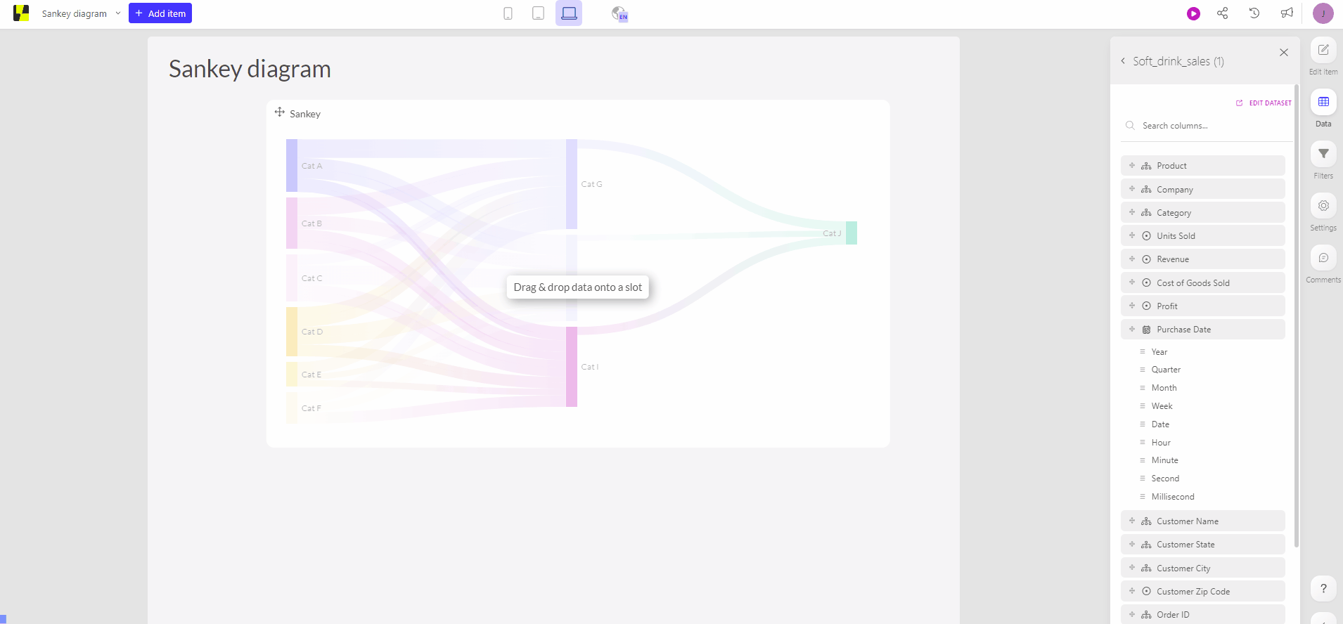
Sankey diagram
A sankey diagram offers the possibility of showing flows and amounts of traffic. These flows are conditional. As such that the width of the streams are dependent of the quantity of the flow. As a tree the sankey diagram breaks down in multiple branches. These branches could be divided into more subcategories. The chart will always indicate the size of connection between two or more subcategories, meaning the sankey diagram is best only used with the sum aggregation.
How
The sankey diagram can be used to visualize the flow from the start to the end. This indicates that you also only need those three elements. A source or beginning point, the flow that can be the measure. Last but not least the destination or endpoint. Flows can be all different kinds of info such as the amount of a people or amount of records.
You can find the sankey diagram within the ‘Special charts' tab, right above the 'financial charts' tab.
Tips and tricks
Sankey diagram can visualize processes of major flows or transfers. Within Luzmo you have the possibility to change the colors as such that the flow contains the source color or the destination color.
History
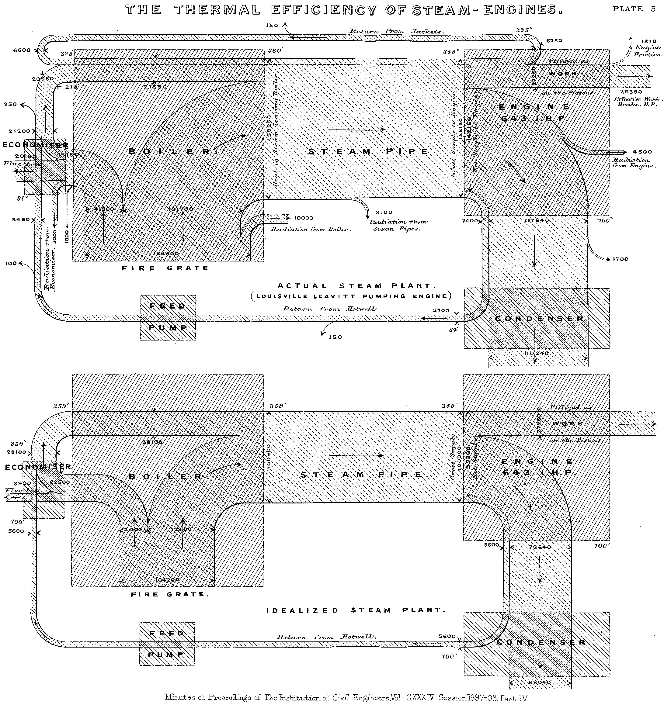
One of the first sankey diagram ever was invented back in the 19th century by Mr. Sankey. He created the chart to visualize the efficiency of a steam engine.

Similar charts
- Alluvial diagram